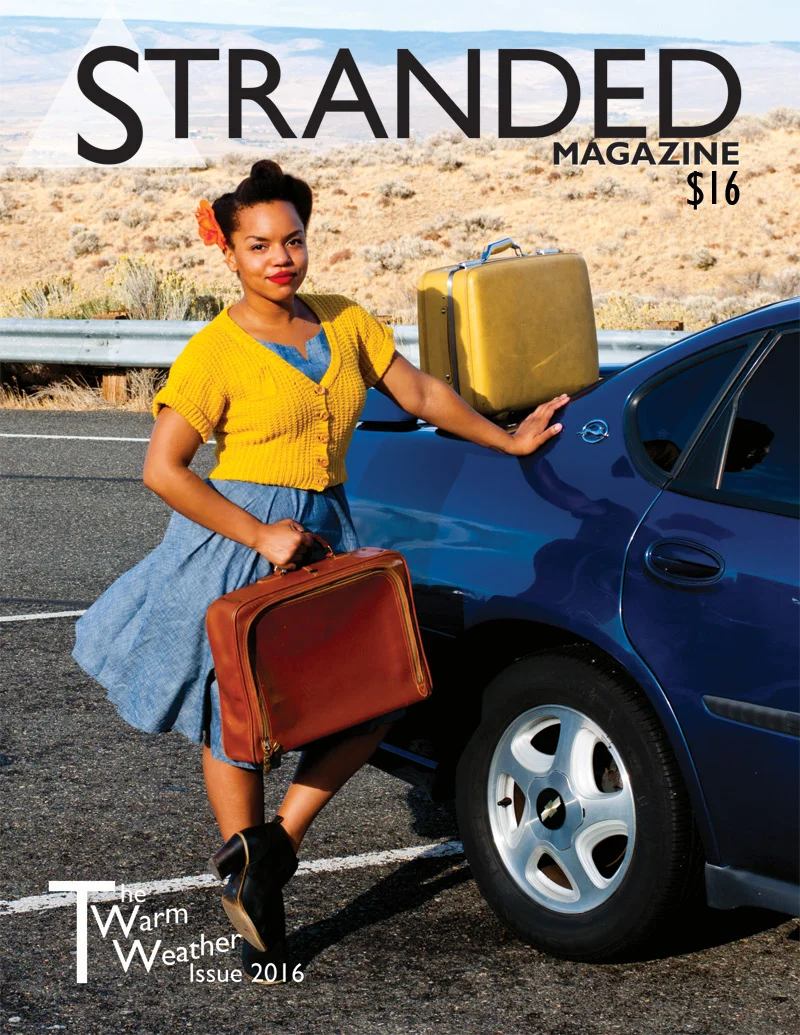
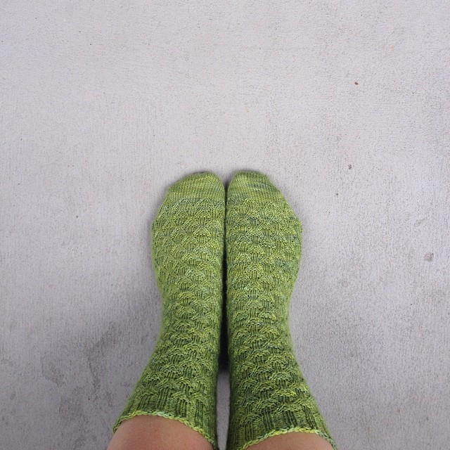
The Interchange Socks by Ariel Altaras was the first pattern to catch my eye in this issue. I am firmly in the toe-up sock knitting camp and the socks are cuff-down but the pattern seems easy enough to flip around if you’re so inclined.
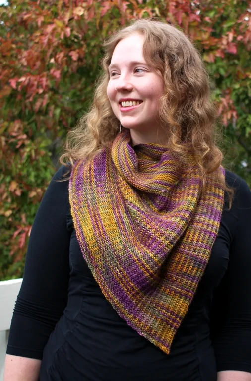
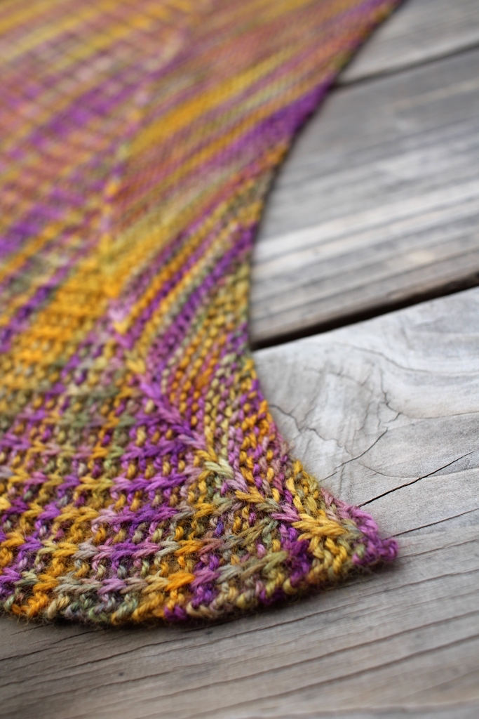
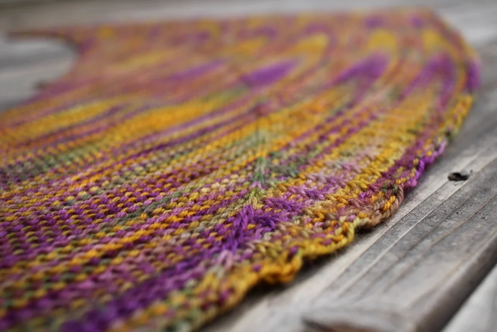
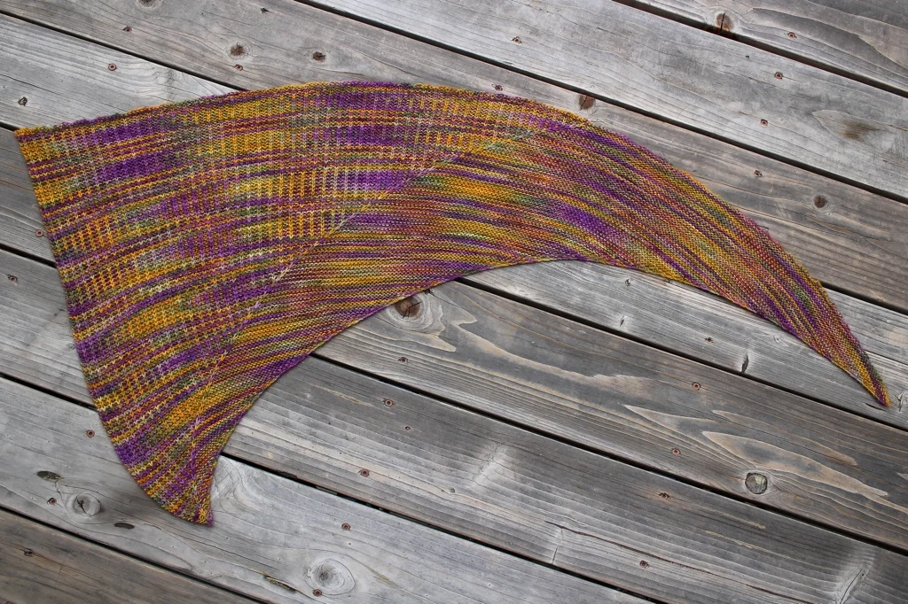
Every single one of the patterns includes a clear schematic in metric and imperial as well as several “lifestyle” and close-up detail photos. It’s nice to see that all the pieces actually seem to fit the model too. There’s no weird bunching or sagging where there shouldn’t be. The patterns are written in a mix of line-by-line instructions and charts as needed. Thankfully, the more complex charts take up an entire page so they’re easy to read. If you hate working from charts, fear not, they’re all written out line-by-line too. With the exception of the mitts and shawl, all the patterns include a number of sizes. Both tops are written in 7 sizes from XS to 3X and the Route 99 hat is easily customizable for both circumference and depth. I would have liked to see a third size on the Interchange socks though.
When you want to print the patterns and stuff them in your project bag, all the ink eating, extraneous stuff - photos, schematics, descriptions, and supplies - is kept to the first few pages so you can print just the instructions. There’s even a handy note in the table of contents so you can print what you want without scrolling through the entire magazine - that’s a small detail that I really like.
Screen Time
So, since this is a digital magazine, how does this all look on the screen? Initially, I set it up to view as a 2-page spread on my 13” laptop and full-screened it so I could get the magazine experience. The photos were beautiful, but the text seemed small and occasionally cramped. I had to zoom in to comfortably read the articles, then zoom out to see the full-page photos which killed the typical magazine experience for me. However, reading the magazine on a tablet or phone as the 1 page spread was a much better experience. The photos were beautiful and easy to read. On a tablet, the text was much easier to read and I’m used to zooming in to read text on my phone anyway.
Final Thoughts
There were two reasons that I bought this issue. The most obvious is that I liked the patterns and wanted to make a few of them. Good, relatable styling helped too. The second is that I wanted to support a magazine with a model that I would like to see flourish more often in the knitting industry. When you buy a copy of Stranded, you get every article, tutorial, and pattern included in it’s pages for $16. Getting 6 patterns for $16 is a pretty good deal with you do the math. What’s more, is that every designer get’s a portion of that $16 from every magazine sold in addition to their flat payment for creating the pattern. Yes, it’s a more expensive than the usual knitting magazine but both the knitters and the pattern designers win.
I’m looking forward to the second issue, Mild Weather 2016, and to see how Stranded evolves in the future. Definitely take a look whether you like to knit for warm or cold temps.

